Understanding the Language of Sustainability As the push for sustainable packaging grows,…


When you’re in a store, why do you pick a certain product over another? Many times, it’s because of the product’s unique packaging. At PI, we know that considerations for packaging are not one-dimensional; many other factors go into a product’s plastic packaging design, like preservation and brand recognition. Consult our list of some of the solutions that packaging provides:

The No. 1 function of packaging is to protect the product from damage or spoilage. Without packaging, outside forces could damage or completely ruin a product during transportation. For food items, inadequate packaging could cause spoilage, making the product defective and even causing health safety concerns. All product packaging, including plastic packaging—like blisters or clamshells, must be suitable to preserve your products in the intended condition.
At PI, we’re constantly examining new industry trends for plastic packaging. Repeatedly, we’ve seen examples of how packaging can be powerful for a company’s brand recognition. Think of some of the bigger-name companies on the market and their products’ packaging. These products have been ingrained in our minds for both structural and design reasons. These designs always have room for change, too. Over time, companies may innovate their packaging to reflect new values or standards or simply to draw in more attention for the product.
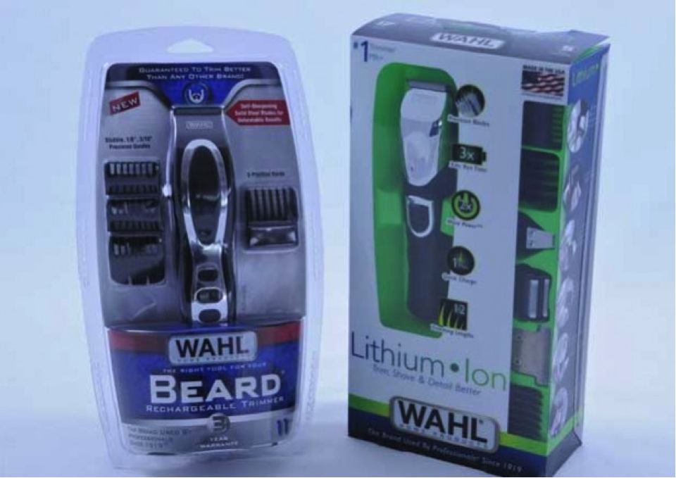
Consider which colors you’ll use for your graphics cards in your blister packaging, as well as who your audience is. Women prefer softer tones, while men lean toward bright colors, so consider your product’s key market when deciding on your design. If you’re packaging makeup, your graphics card could be comprised of soothing colors like light pink or lavender, while a graphics card for a men’s razor could be bold blue or green. For products in more clinical industries, like the medical field, you may want your packaging to be plain and without frills. In this case, clear, crisp packaging will create the sterile, sanitary mood in line with your consumers’ needs.
While a quirky packaging design may not be ideal as a long-term packaging solution, it may be a perfect way to draw attention to a limited-edition product or one that is a bit of a novelty to itself. The Dumbbell sports drink is a great example of this—the company designed the bottle with fitness in mind, so its packaging is completely fitting. Products with blister packaging don’t have as much room for creative innovation in terms of structure, but you can structure your product in the blister packaging creatively, as ezdock did. Blister packaging can also be ideal for products with a unique design that would look best displayed up front, opposed to in a box or other packaging option.
