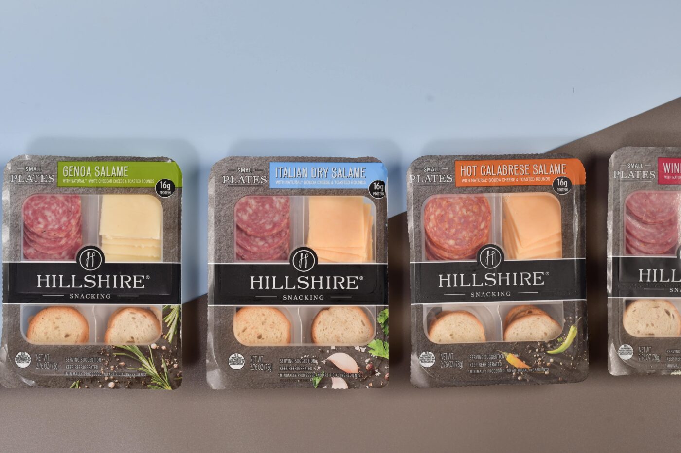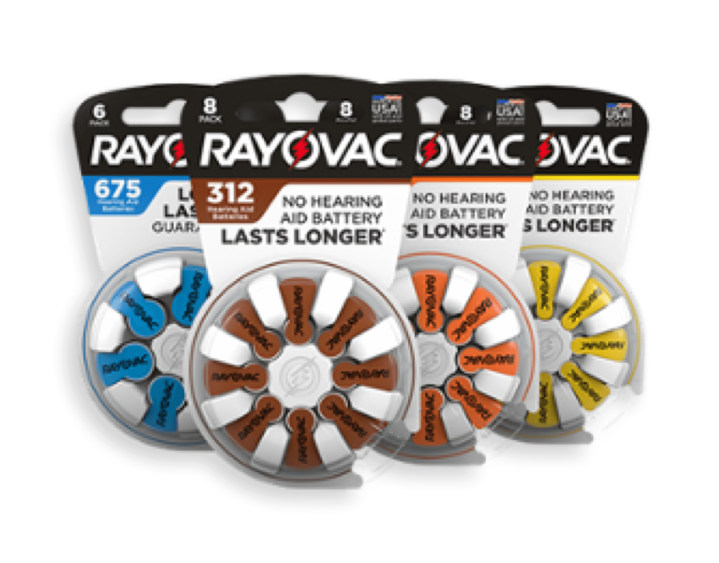
After years of lagging behind more commonly recycled materials like PET bottles,…


Plastic Ingenuity specializes in helping companies create customized packaging designs, and throughout our experience, we have noticed that plastic packaging needs to meet various requirements to ensure it performs well in stores. A product’s packaging needs to be practical, protective and composed of the top plastic materials, all while having a memorable branded design. To help you create a packaging design that’s ready for retail markets, consider the following ideas.
As you are planning the packaging for your product, you need to make sure it’s compelling. Oftentimes, this means creating a customized packaging design that is unlike anything else on the shelves through the process of thermoforming. Some of the best plastic packaging styles have been created through customized thermoformed designs. You can try simple shapes or you can take a less traditional approach, as the Glogi brand did. Of course, choose the packaging shape that works best for your product. Envision how you want your packaging to look on the shelves, and plan accordingly.
More than anything, your plastic packaging needs to be protective. Without a tough material guarding the product, it may become damaged during transportation, and it could also be susceptible to theft. Your packaging should function as a protective barrier to outside elements, but if the design is too difficult to open, it may alienate consumers. You can work with your plastic manufacturer to create a customized design that is easy to open. Blister packaging could work well for both keeping your product protected while still maintaining an easy-open style.
In terms of packaging structure and design, sometimes simplicity really is the best option.
A minimalistic plastic packaging approach can even complement the product itself. Babee followed this cue when packaging their honey in simple plastic jars designed to look like a honeybee. While the design was far from jazzy, it was the right balance of minimalism and modern—exactly what draws in consumers in today’s market. Your label can be simplistic, too, as Selfridges & Co.’s line of balsamic vinegar, olive oil and pasta is.
Once you’ve decided on your packaging design, you’ll need to choose the materials to create it. Here, consistency is key. If a consumer purchases your product once and it’s made with one material and a different one the next, they may become confused. To establish yourself as a leading company in your industry, you need to present your product similarly every time. One shouldn’t be made of one type of plastic and another of something completely different. Many companies commonly use PET, PETG, ABS, HIPS, PVC, and HDPE plastics to construct their packaging designs. Label colors should also be similar across the board.
Your product’s packaging needs to be protective, but branding is almost equally as important. Without branding, customers can become confused when they see your product on shelves. For example, when Tropicana simply changed its iconic orange illustration, customers felt confused and betrayed. Because the packaging changes were so far away from Tropicana’s original branding strategy, the company lost the recognizability factor that was crucial to its sales.
While there is nothing wrong with tweaking your packaging design or even doing a complete rebrand, you need to make sure consumers can still identify your product. If you do make drastic structural changes, consider following Pepsi’s lead. The beverage company introduced a new label in 2008, and then a few years later, they rolled out a streamlined, modern bottle design. While the changes themselves were not over-the-top, Pepsi knew that to keep its branding relevant in the eyes of consumers, they would need to gradually introduce them. You want to keep consumers happy, not alienated. Progressive design and structure changes can ensure consumers still recognize and want to engage with your product.
Keep in mind that there is always room for improvement and you may want to make a change in the future. This could mean something as simple as the illustration and graphics on your packaging or a whole new extension upon the brand. Consider the examples from Tropicana and Pepsi. The Method line also successfully completed a product redesign with its dish and hand soap. The bottle was a simplistic plastic packaging design to begin with, yet a new thermoformed design was eye-catching without being too jarring.
You have planned out your packaging design with your plastics manufacturer and are satisfied with the result. Even though you may think the packaging is finalized and ready for stores, don’t forget the value of quality control. Your product is valuable, so you want to make sure it is represented as such through the packaging. Examine the product for both structure and design to assure you are satisfied with the plastic packing in its entirety. Your plastic manufacturer can then follow your specifications to ensure your packaging meets your expectations.
